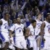
slufan13 Posted January 15, 2015 Share Posted January 15, 2015 Undefeated in the new unis. Who knew that that's all it would take? Quote Link to comment Share on other sites More sharing options...
wgstl Posted January 15, 2015 Share Posted January 15, 2015 I do love the Uni's. Them shorts fire. Quote Link to comment Share on other sites More sharing options...
hsmith19 Posted January 15, 2015 Share Posted January 15, 2015 I like the return to the arched lettering on the front. Not a huge fan of the teeny tiny player names on the back, or of the weird trim under the armpits and the diamond thingy on the shorts. Still wish the Billiken face logo was bigger on the shorts. Quote Link to comment Share on other sites More sharing options...
TheChosenOne Posted January 15, 2015 Share Posted January 15, 2015 I like the return to the arched lettering on the front. Not a huge fan of the teeny tiny player names on the back, or of the weird trim under the armpits and the diamond thingy on the shorts. Still wish the Billiken face logo was bigger on the shorts. What is with the names on the back? Quote Link to comment Share on other sites More sharing options...
TaLBErt Posted January 15, 2015 Share Posted January 15, 2015 The new uniforms look cheap. Quote Link to comment Share on other sites More sharing options...
Dwayne's_World Posted January 15, 2015 Share Posted January 15, 2015 Really liked the shorts, the jerseys need a little more work. Quote Link to comment Share on other sites More sharing options...
hsmith19 Posted January 15, 2015 Share Posted January 15, 2015 Does anyone know if this is going to be the regular home uniform now? It doesn't seem different enough from the old one to use as an alternate. Quote Link to comment Share on other sites More sharing options...
BigMouthBilliken Posted January 15, 2015 Share Posted January 15, 2015 Does anyone know if this is going to be the regular home uniform now? It doesn't seem different enough from the old one to use as an alternate. Didn't see a difference except for the shorts Quote Link to comment Share on other sites More sharing options...
hsmith19 Posted January 15, 2015 Share Posted January 15, 2015 For the last two years "SAINT LOUIS" has been straight across the front of the jersey. This one has arched lettering, but it looks a little different than the previous one with arched letters. The name on the back is scrunched way, way smaller than it ever has been. The number font on the back also looks a little different (McBroom's 2 looked even more like a Z). The weird trim under the armpits of the jersey is also new. And yeah, I do have a slight case of Uni-Watch OCD. Quote Link to comment Share on other sites More sharing options...
billikenfan05 Posted January 15, 2015 Share Posted January 15, 2015 Blame falls squarely on Nike Quote Link to comment Share on other sites More sharing options...
Deutschkind Posted January 15, 2015 Share Posted January 15, 2015 I agree with the consensus here. The shorts look great, but the play names are terrible. If I didn't know the names, I probably wouldn't be able to read them. It seems to be about the same amount of change from the the 11-12 jersey to the 12-13, 13-14 jersey. Just a few changes but the look is mostly the same. I like the arched SAINT LOUIS better than flat I think. Weird they did it mid-year. Nike really late? Was too busy trying to find the right shade of green for the Philladelpha Eagles? Quote Link to comment Share on other sites More sharing options...
hsmith19 Posted January 15, 2015 Share Posted January 15, 2015 Maybe now we will at least be able to buy home white jerseys at the team store. The only ones I saw this year previously were the blue road jerseys with McBroom's #2 at the bookstore. And they had the design screenprinted rather than sewn on. Quote Link to comment Share on other sites More sharing options...
BigMouthBilliken Posted January 15, 2015 Share Posted January 15, 2015 Maybe now we will at least be able to buy home white jerseys at the team store. The only ones I saw this year previously were the blue road jerseys with McBroom's #2 at the bookstore. And they had the design screenprinted rather than sewn on.Would buy one if #4 (MY) or #5 (DR) Quote Link to comment Share on other sites More sharing options...
billikenfan05 Posted January 15, 2015 Share Posted January 15, 2015 Maybe now we will at least be able to buy home white jerseys at the team store. The only ones I saw this year previously were the blue road jerseys with McBroom's #2 at the bookstore. And they had the design screenprinted rather than sewn on. Would buy one if #4 (MY) or #5 (DR) Don't count on either happening this year and don't count on white being sold anytime soon. Quote Link to comment Share on other sites More sharing options...
BigMouthBilliken Posted January 16, 2015 Share Posted January 16, 2015 Don't count on either happening this year and don't count on white being sold anytime soon.I get the no # 4 and 5 but why shouldn't I count on no white jerseys? Quote Link to comment Share on other sites More sharing options...
Pistol Posted January 16, 2015 Share Posted January 16, 2015 Can I get a picture of the new unis? Lot of chatter about them but I haven't seen any good shots yet. Quote Link to comment Share on other sites More sharing options...
hsmith19 Posted January 16, 2015 Share Posted January 16, 2015 Arched lettering on the front: Diamond pattern with Billiken face on left leg: Diamond pattern with SLU on right leg, plus weird, tapered armpit piping: Haven't seen any good ones of the teeny tiny names on the back, but they wouldn't be readable from further than 10 feet away anyway. Quote Link to comment Share on other sites More sharing options...
billikenfan05 Posted January 16, 2015 Share Posted January 16, 2015 I get the no # 4 and 5 but why shouldn't I count on no white jerseys?Because blue jerseys are an easier sell. They don't get dirty as quick or that's the idea... Quote Link to comment Share on other sites More sharing options...
Littlebill Posted January 16, 2015 Share Posted January 16, 2015 The new uniforms look cheap. +1 Quote Link to comment Share on other sites More sharing options...
Littlebill Posted January 16, 2015 Share Posted January 16, 2015 The new uniforms look cheap. +1 Quote Link to comment Share on other sites More sharing options...
FromDaEastSide Posted January 16, 2015 Share Posted January 16, 2015 A view of the small name on back Photo from Chris Lee of the Post-Dispatch Quote Link to comment Share on other sites More sharing options...
hsmith19 Posted January 16, 2015 Share Posted January 16, 2015 Hadn't noticed this before, but Indiana State is evidently using the exact same template and color palette (with a little more black) this season: Quote Link to comment Share on other sites More sharing options...
Pistol Posted January 16, 2015 Share Posted January 16, 2015 Thanks for the pics. I don't know, they're not bad. I wasn't wild about our previous ones. Most of ours over the years have just been 'fine' in my book. I'm not super attached to any. I'm not a big fan of third (and fourth) colors when the school has two official colors. I think I'd probably give the edge to what we had for the first half of the season, but not by much. It'd be nice to have a one-of-a-kind design, but I know that's not how it works and that the coaches are picking from Nike templates. Quote Link to comment Share on other sites More sharing options...
Deutschkind Posted January 17, 2015 Share Posted January 17, 2015 Looking at that picture, I like the old one better. Quote Link to comment Share on other sites More sharing options...

Recommended Posts
Join the conversation
You can post now and register later. If you have an account, sign in now to post with your account.